
Storytelling in Production: How Animation and Data Visualization Are Changing Climate Documentaries

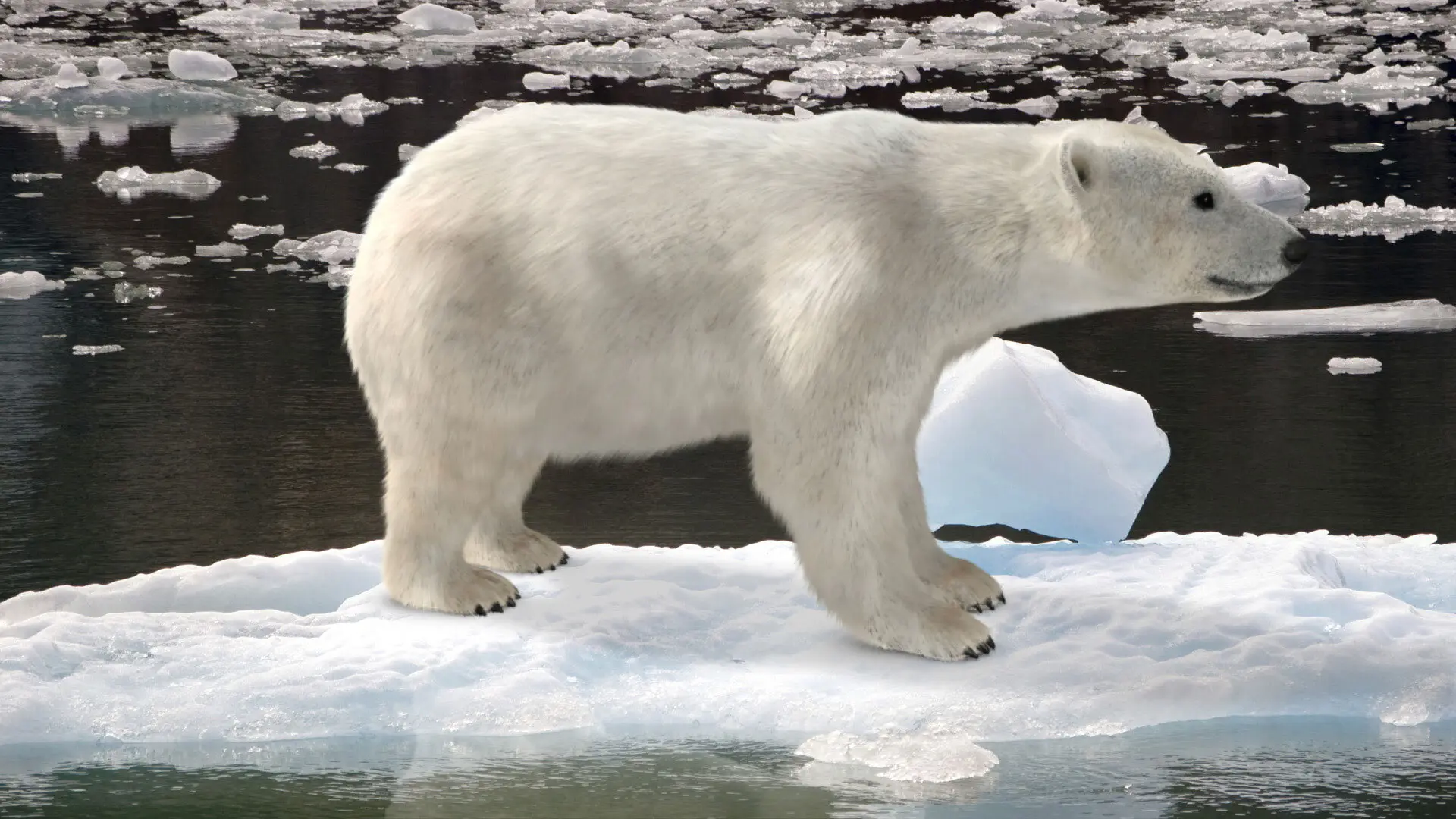
When audiences see an animated heat map spreading across the globe — decades of temperature data compressed into a few seconds of motion — climate change stops being an abstraction. It becomes visceral. A stranded polar bear on a shrinking ice shelf does the same thing, but animation and data visualization take it further: they can show what cameras cannot capture, compressing time, rendering the invisible, and making the math feel human.

That shift from telling to showing is the core of visual storytelling, and it’s reshaping how documentaries communicate the most complex story of our time.

Why Static Charts Aren’t Enough

Climate science generates enormous volumes of data — satellite imagery, ocean temperature readings, atmospheric carbon measurements, glacial retreat timelines. Presented as spreadsheets or static graphs, this data struggles to hold an audience. But when a production team transforms that data into animated maps, 3D terrain models, or time-lapse simulations, the numbers start to breathe.

Al Gore’s An Inconvenient Truth was one of the first major documentaries to put data visualization front and center, using animated charts and projected graphs to walk audiences through decades of atmospheric science. Chasing Ice took a different approach, using time-lapse photography from automated cameras across the Arctic to show glacial retreat in real time — turning years of change into minutes of undeniable visual evidence. Each film proved the same point: the right visual treatment makes data impossible to ignore.

The Rise of Animated Maps and Simulation

More recent productions have pushed the boundaries further. Degrees of Uncertainty, an animated data-driven documentary, uses hand-coded data visualizations to explain climate science while asking hard questions about how we process scientific evidence. Arctic Shifts (2026), a collaboration between artist Anna Lindemann and polar climate scientist Dr. Alice DuVivier, blends scientific climate simulations with speculative storytelling to visualize how human activity reshapes Arctic ecosystems.

These aren’t explainer videos with stock footage and voiceover. They are produced works where the animation is the storytelling — where the movement of data across a map carries the same dramatic weight as a character walking through a flooded neighborhood.

Animated maps, in particular, have become one of the most effective tools in documentary production. A well-crafted map animation can illustrate the spread of wildfire seasons across decades, trace shifting migration patterns driven by drought, or show the retreat of coastlines under rising sea levels. The technique gives audiences a spatial and temporal understanding that static imagery simply cannot deliver.


What Good Visual Storytelling Requires

The technology is only half the equation. An animated climate visualization can be technically impressive and still fail as storytelling if it lacks narrative structure. The productions that work share a few traits:

They lead with a question, not a conclusion. The best climate visualizations don’t just illustrate a point — they unfold a story. They show before-and-after. They let the data reveal something unexpected. Audiences engage when they feel like they’re discovering the truth alongside the filmmaker.

They pair data with human scale. A map showing global temperature anomalies becomes more powerful when it zooms into a specific region and connects the data to a community, a species, or a livelihood. The macro view provides context; the micro view provides emotion.

They respect pacing. Animation allows precise control over how fast information is delivered. The best productions use that control deliberately — slowing down at moments of impact, accelerating through decades to show the scope of change, and pausing to let a striking image land.

They invest in sound design. Immersive scoring and well-placed sound effects reinforce the emotional arc of a data visualization. A rising tone under an accelerating temperature graph, ambient ice-cracking sounds under a glacial retreat animation — these details turn information into experience.

The Production Pipeline

For studios producing this kind of work, the pipeline typically combines several disciplines. Climate data is sourced from research institutions and translated into visual formats using tools like After Effects, Cinema 4D, or custom-coded visualization engines. Motion graphics artists work alongside researchers to ensure accuracy, while editors and sound designers shape the final narrative.

It’s a process that requires both technical precision and creative instinct — the ability to look at a dataset and find the story hiding inside it.

Why It Matters for Brands and Organizations

This isn’t limited to feature-length documentaries. Nonprofits, government agencies, research institutions, and mission-driven brands are all using animated data visualization to communicate climate stories — in campaign videos, social content, educational materials, and advocacy presentations. The same storytelling principles apply whether the format is a 90-minute film or a 60-second social spot.

The organizations that communicate most effectively about climate are the ones that invest in visual storytelling — not as decoration, but as the primary vehicle for understanding.

At Pixeldust, we’ve spent years turning complex information into compelling visual narratives. Whether it’s a documentary, an institutional campaign, or an educational series, the challenge is always the same: find the story in the data, and bring it to life in a way that audiences feel, not just understand.

Ready to start your project? Let's make it happen.
Get a Free Quote