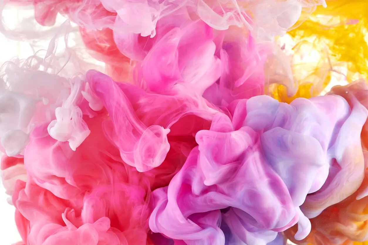
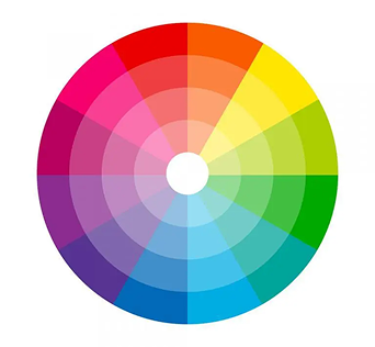
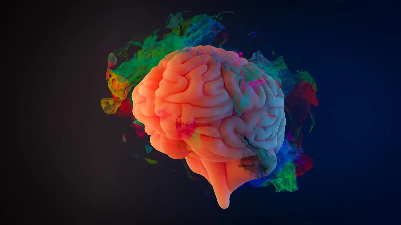
It’s no secret that we associate different colors with different feelings, emotions, and contexts. For example, we tend to relate red with passion, love, or even anger and frustration. Understanding these color connotations helps reinforce your story’s themes and messages. Generally, warmer colors like red evoke excitement and urgency, while cooler tones create a sense of relaxation and mystery.
Finding the right balance between warm and cool hues in your color scheme is crucial for aligning with your story’s narrative. However, navigating color meanings isn’t straightforward; interpretations can vary across cultures. For example, white in some cultures signifies purity and cleanliness, while in others it can signify death and mourning. So be sure to keep your target audience in mind when selecting colors for your design. It’s a delicate balance, but getting it right enhances your storytelling impact significantly.