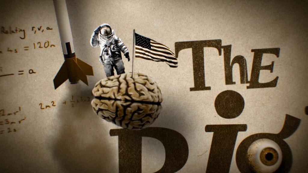
The Big Fib is based on the hilarious podcast “Pants On Fire.” Two grown-ups claim to be experts, but one of them is lying. Kids use their critical thinking, powers of observation and gut instincts to work out who is telling the big fib. The show features fascinating facts, tricky fibs, a bold child and an all-knowing, goofy robot.
Disney+ wanted a design partner that could deliver a fun, engaging graphics package for viewers of all ages.
The graphics carry straight onto the set, where the show’s main screen features the Big Fib artwork behind the host, the contestants and the robot.


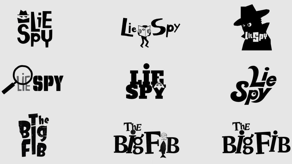
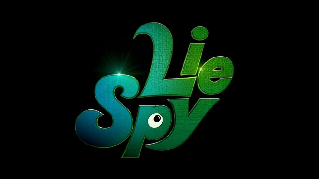
After the producers briefed Pixeldust, the team dug into research and explored a wide range of ideas and styles. Several storylines for the opening sequence were written, and multiple logos and style frames, from juvenile to cool, went to the client. Early rounds were built around the working title “Lie Spy” and later adapted to the final name.
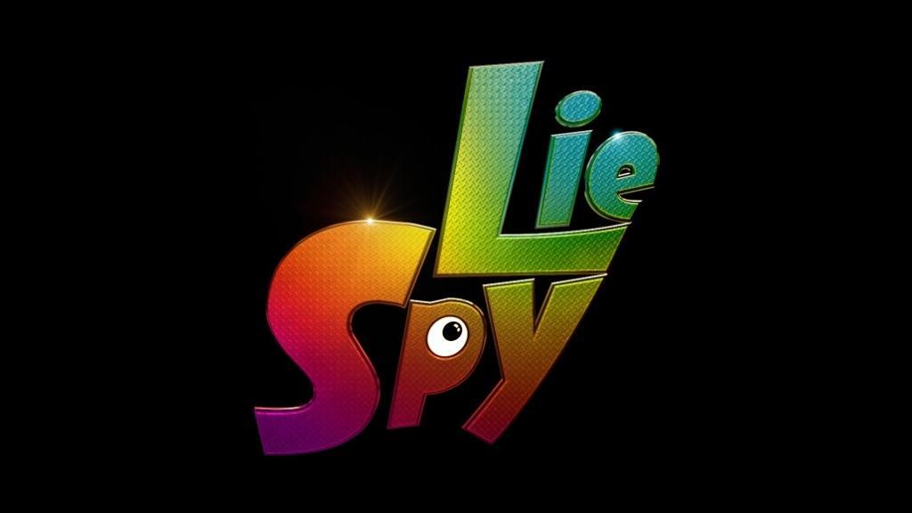
Lying is everywhere in today’s “fake news” world, but the show proves how easy, and how funny, half-truths can be. Pixeldust pitched a fun, optimistic angle built on two questions: how can kids spot someone who isn’t who they appear to be, and what are the tells of a liar?
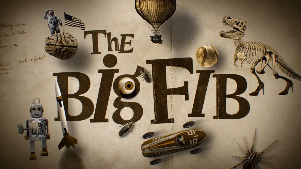
With those questions in mind the team explored fonts, illustrations and iconography, and landed on a logo built from the elements of the story. It had to work equally well in animation and in stills, because a large marketing campaign was planned around the show. The logos here are a selection of the many designs.
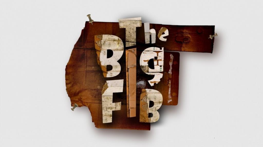
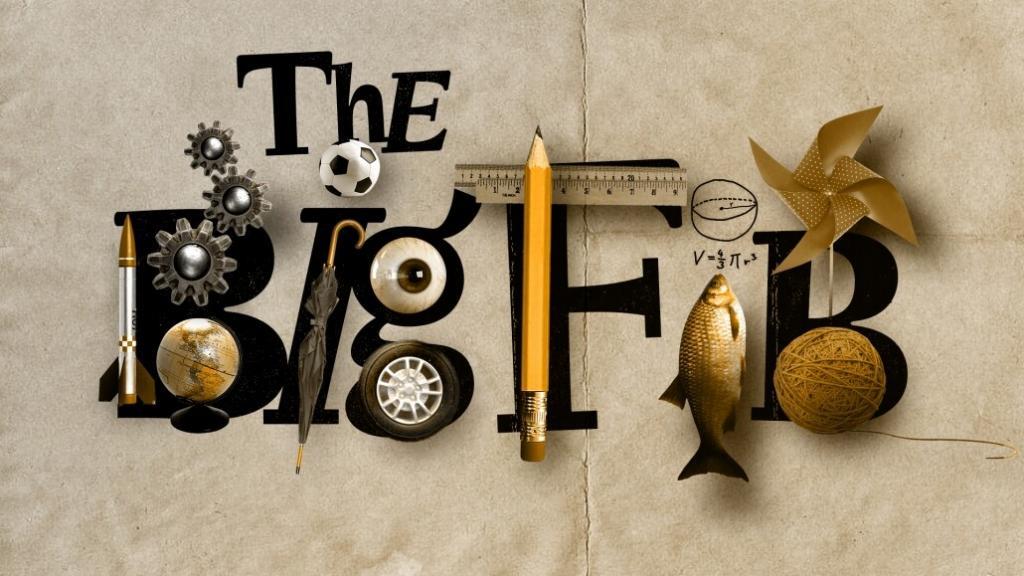
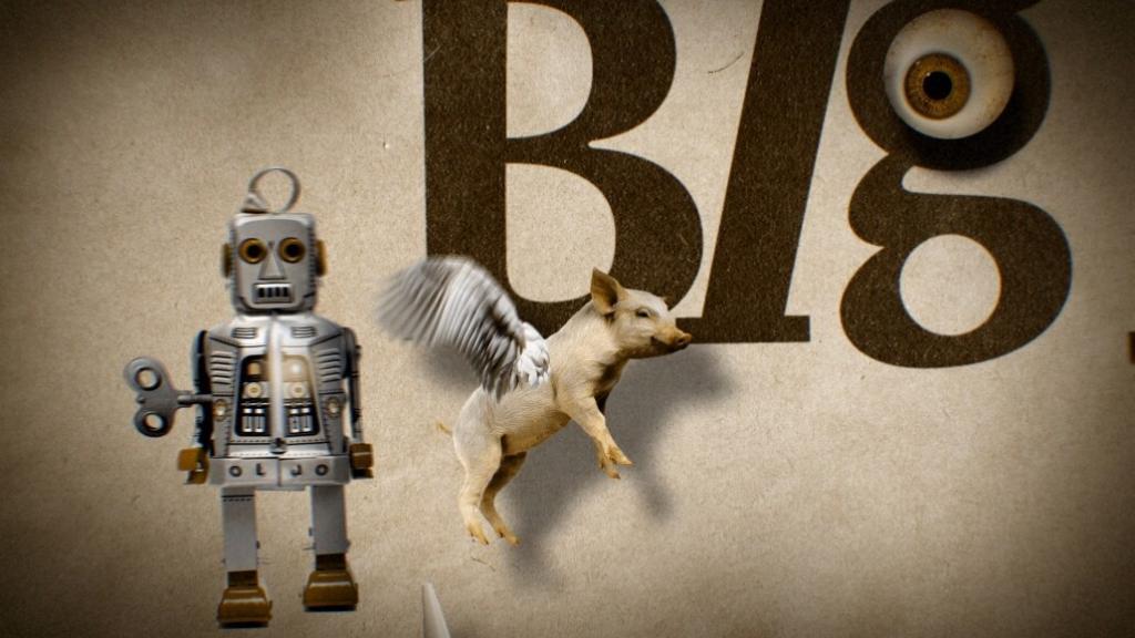
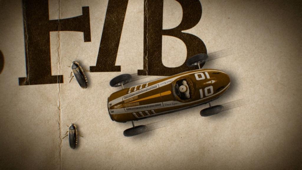
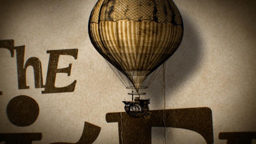
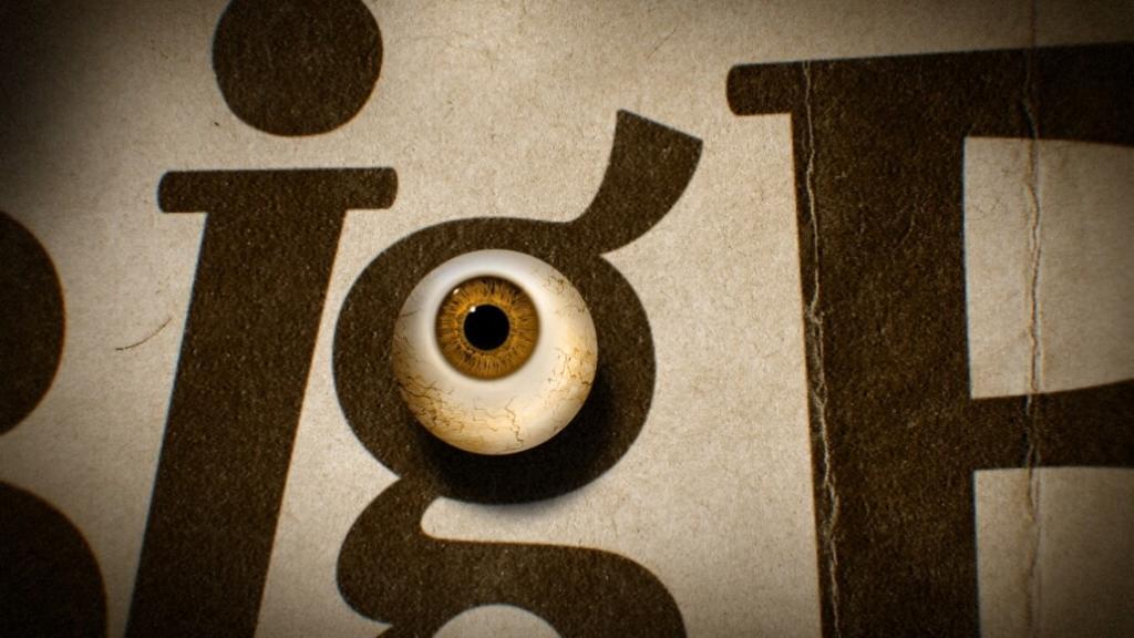
After narrowing the vision, the client chose the Wes Anderson-inspired direction. The final look feels like an encyclopedia of knowledge, only slightly twisted. Look at the cute piggy. But why is it flying? An astronaut stands on the moon. Oh wait, he is standing on a brain. A T-Rex stomps in high heels. Not everything is what it seems.
The Big Fib is streaming on Disney+. Gather the family and see if you can tell who is telling the truth.