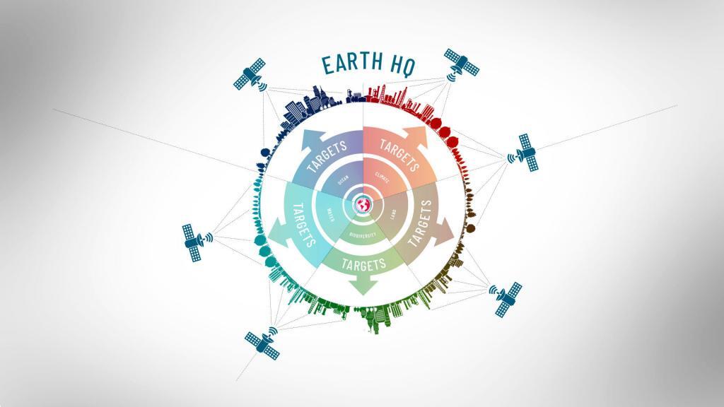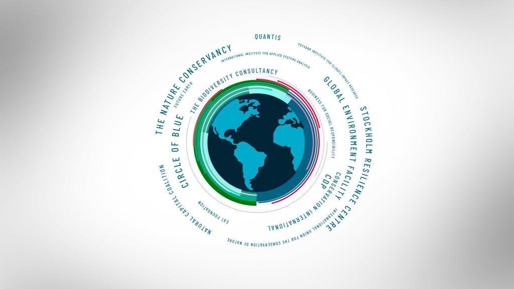
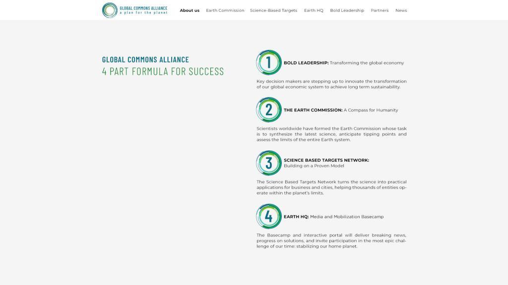
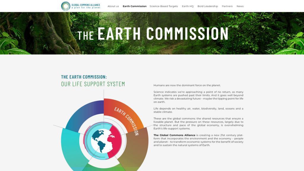
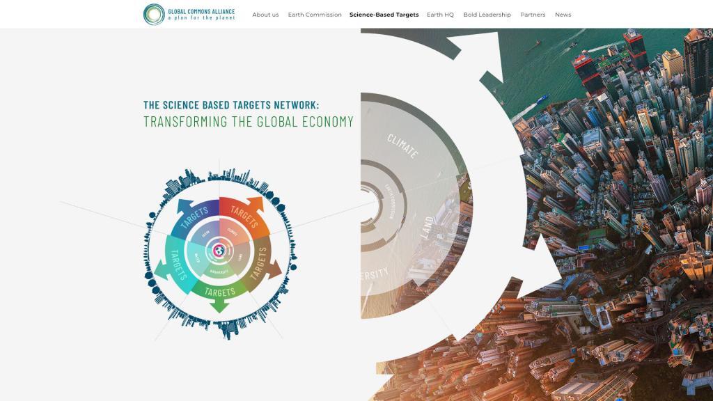
For the Global Commons Alliance, Pixeldust designed the website and a set of animated infographics that explain the Alliance’s plan for the planet’s shared systems.
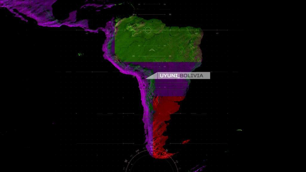
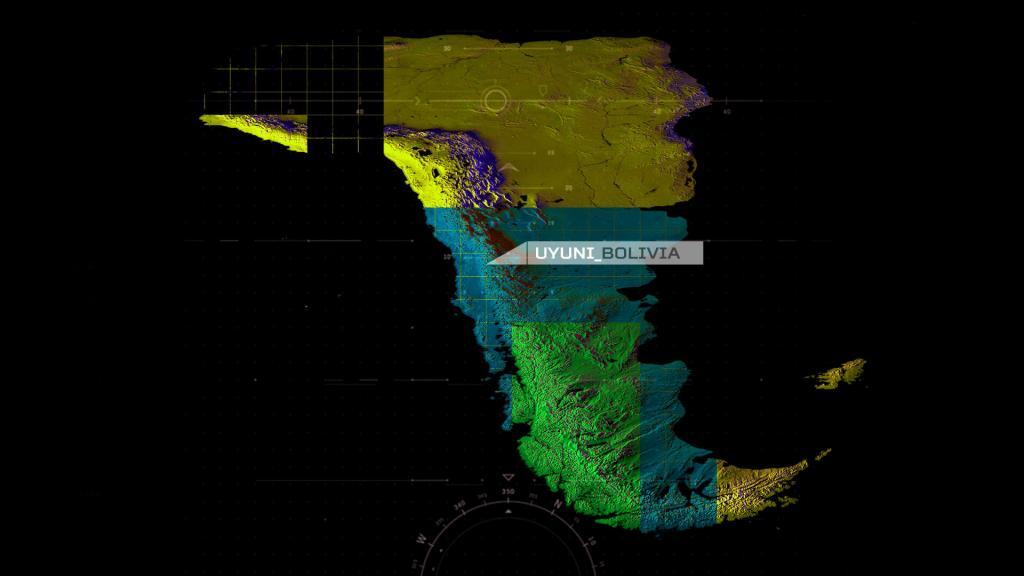
Animated point maps are a powerful way to visualize spatial data, movement and change over time. Point-based mapping reveals patterns, trends and geographic relationships that are hard to see on static maps.
By combining motion, timing and precise geospatial data, animated maps communicate complex information clearly and engagingly, ideal for data storytelling, urban analysis, environmental studies and interactive cartography.


For PBS’s American Umpire, Pixeldust created web design and animated infographics that turn history and data into clear, cinematic visuals.
Circular title animations carry the Global Commons Alliance’s visual language into motion, opening its videos with the same rings used across the infographics and website.