During an initial four-week research and development phase, Pixeldust explored many different logo options. The team also wrote tag lines alongside the designs; those lines informed the logos and eventually became part of the animated end tags. One of the many directions presented was a glassy, dynamic 3D package.
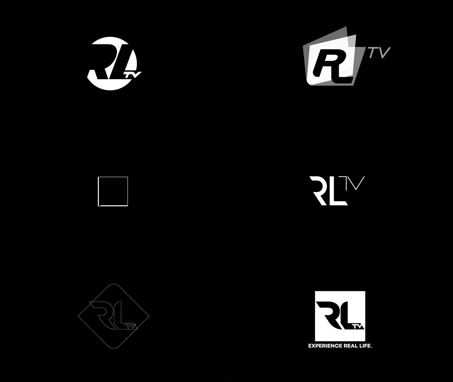

The network is built around the main brand, RLTV, and two sub-brands, RLPRIME and RLURBAN. The final logo system gives each its own tag line while keeping the family unmistakably connected: Experience Real Life, ReDefining Life, and Richer, Fuller, Living.


Based on the final logo and its distinctive shape, Pixeldust developed the graphic elements for the promo package. Since combining live-action footage with graphics wasn’t an option, the team focused on strong typographic ideas that could hold the viewer’s attention on their own, starting with a bold, easy-to-read font that complements the elegance of the logo.
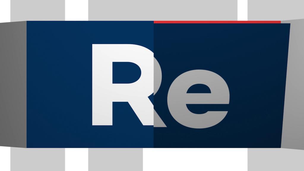
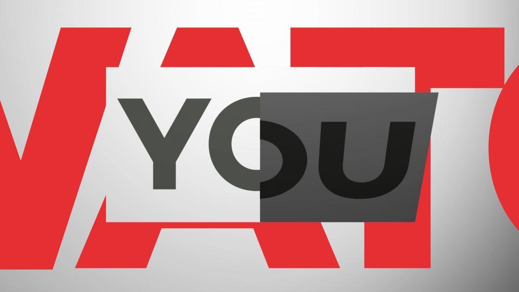
The core concept was turning pages: at 50, many of RLTV’s viewers are entering a new chapter in life. The idea let the designers create typographic collages by deconstructing and rebuilding the logo and titles, build dynamic transitions, and produce a highly rhythmic promo package.
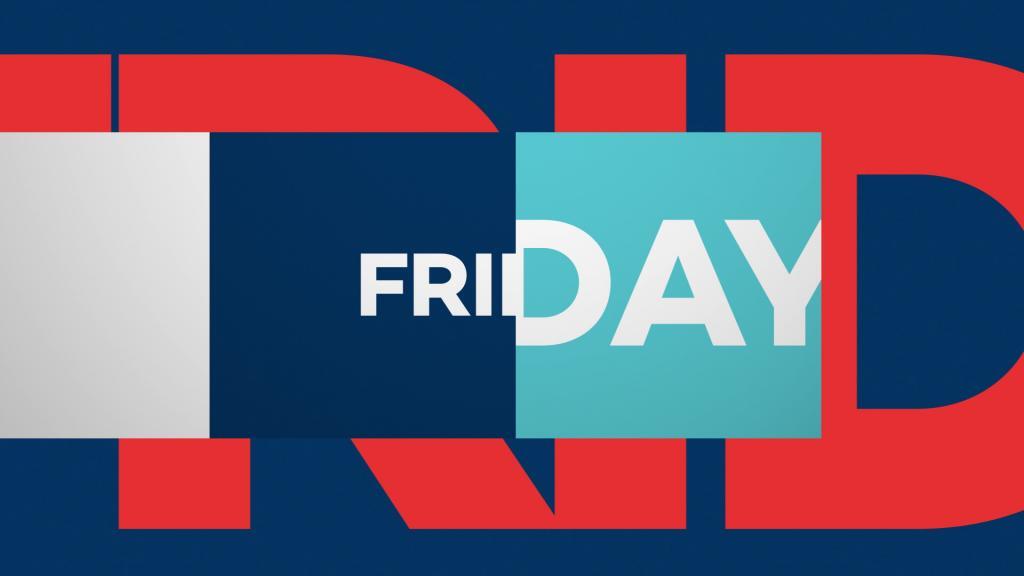
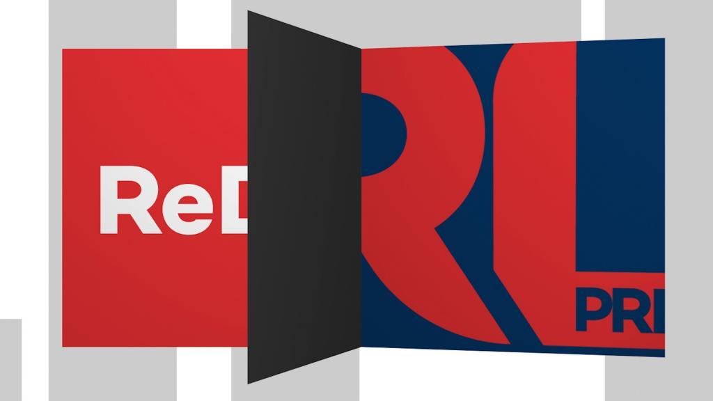
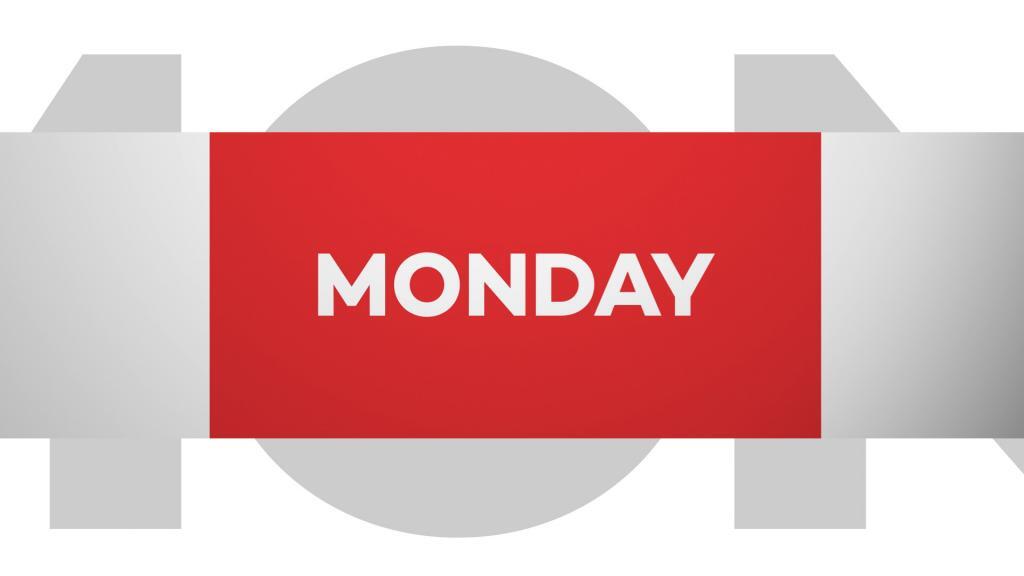
With the concept, logo, typography and core design elements established, Pixeldust designed the rest of the package: animated logo end tags and bugs, tune-in title cards for each day of the week, seamless transitions from programming to promo, bumpers, promo end pages and a lower-thirds package.
Every element came with a comprehensive, easy-to-use After Effects toolkit for RLTV’s in-house producers and editors, plus two color palettes: bright colors for daytime promos and a more muted look for nighttime programming.